Thursday, September 24, 2015

About $100K over the budget, but a girl can dream, right?

I haven't decided whether or not the fun outweighs the depression when you look at houses outside your price range, especially when you find your dream house, but I keep doing it. If nothing else, it gives me something to post about.

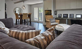
Take a look at this beauty I found today. It has 3 bedrooms and 3 bathrooms, plus a guest house that is not included in the 3574 square feet. It was built in 1957 and sits on over half and acre of beautifully landscaped property.

When I showed the listing to my daughter, she was bowled over and sent me a message that said, "This would be worth the mortgage. OMG!"

If we bought this property, we'd definitely be "house poor" and living on pasta for the rest of our lives, but c'mon...look at all those windows!


Tuesday, September 22, 2015

And then there were two

Just what you need when you're trying to make a decision is to have another variable thrown into the mix. That's what happened yesterday when we found another house that immediately became a strong contender.

Here's what the newcomer has going for it:

  • Built in 1949
  • Very private cul-de-sac on a bluff
  • Living space: 2514 square feet
  • Lot size: .58 acre (25,264 sf)
  • Sprinkler system
  • Deck, patio and small front porch area
  • Gorgeous landscaping
  • Fantastic view of the downtown skyline
  • Built-ins
  • A round kitchen
  • An existing suite for me

Yes, that's right...a ROUND kitchen. It's the coolest thing you've ever seen, and it would be the perfect spot for a Saarinen tulip table or a Noguchi Cyclone. The best thing, though, is that it's already been restored and is move-in ready. Take a look.


Stone and wood exterior


Upper deck off living area

Lower patio in front of walk-out basement

Top tier of back yard

View from deck
(no neighbors...just woods)

More yard down that hill

Wall of windows from in den looking onto the upper deck

Formal living room
(which we would open up  into the den to make one large room)

Dining room with built-ins
(which would become a study)

Round kitchen

Kitchen built-ins

Coral and turquoise master bath

Sunday, September 20, 2015

Part 2: How bad is too bad?

Remember when I asked in a post a few days ago if a house could skip "bad" and go straight to "too bad"? After making an appointment to see said house, here is what we found upon entering.

We were a little surprised that the sellers hadn't made even the most minimal effort to clean out the house. It would quite literally take a crew with a dump truck to get rid of all the detritus that was left behind when the previous owner vacated. That's probably one of the reasons it's been sitting on the market for 170 days.


The verdict: It is a lot cooler than we had expected...and in worse shape than we thought, inside and out. In addition to the mounds of trash and abandoned personal belongings, we found obvious water damage, possible mold, and general dilapidation of wood and stone structures outside.


Still, we haven't ruled it out, if for no other reason than that both bathrooms have vintage Pomona tile designed by George Nelson sometime in the late 50s or early 60s for the Distinguished Designer series (which included tiles by Paul McCobb, Millard Sheets, Dorothy Liebes, Saul Bass, Paul Laszlo, and Dong Kingman). At some point, the top of the vanity in one bathroom was replaced with marble, but I found a lot of 76 of the tiles on Ebay, and failing finding the same tile later, we could always have it tiled with a complementary untextured tile. (Yes, I'm already starting to obsess.)


ebay.com

Friday, September 18, 2015

Bertha? Highly unlikely.

Back in 2011, the store was brand new, and we were mainly selling G-Plan credenzas that we picked up for $50 at auction. Upscale pieces were still in our future, and, like most novices in the MCM game, we still believed the incorrect attributions we found online.

In August of that year, I wrote a biographical post about Bertha Schaefer and included photos of the travertine and walnut coffee and end tables that are often attributed to her. Later I became aware of the controversy surrounding those attributions, but I forgot to update my post. Yesterday a blogging friend pointed that out to me, so I removed the photos and want to set the record straight.

Here is the long oval coffee table from the series in question. We had this one in our store until just a few weeks ago, and this photo was featured on Shopseen.


shopseen.com


While many people have searched for evidence that Schaefer designed the group, it seems that all anyone knows for sure is that it was produced by Gordon's of  Johnson City, Tennessee.


designaddict.com

Tuesday, September 15, 2015

How bad is too bad?

We're almost finished undoing the damage done to our 1964 home by well-meaning real estate flippers. However, life has a funny way of playing tricks on you when you're not looking, and it appears that my daughter, grandsons and I may be putting this house on the market before I post the "after" photos.

However, we have located a house a few blocks from our current address that we're very tempted to buy. It was built in 1962 and is a one-owner property. From the looks of the photos, the people who lived there got too old to maintain the place and let it fall into serious disrepair, inside and out.

It's obvious that the yard was once landscaped magnificently, but it's so overgrown that you can't even see the huge double front doors from the street. The interior is spacious and has some great features...lots of rock walls and fireplaces, beamed ceilings, wonderful windows, original slate floors, unique architectural features, and a gorgeous room divider.

There's no doubt that this house could easily be a real showplace worth more than twice the current asking price when restored, but a long and arduous renovation taking at least two years would be necessary. We think we might be able to get a really low offer accepted, because the house has been on the market quite some time, which would give us a low enough monthly mortgage payment to pay cash for repairs as we go.  My daughter definitely has the patience to take her time and have the work done in stages...but do I?

Can a house skip "bad" and go straight to "too bad"? Or would it be worth the effort to restore a diamond in the rough like this, even if it takes a while? What are your thoughts?


Sunday, September 6, 2015

Henry Hill

Henry Hill (1913-1984) was born in England, but the architect grew up in Berkeley, California, and is best known for the design work he did in the San Francisco area.

He studied architecture at the Berkeley campus of the University of California and then went on to Harvard's Graduate School of Design, working with the famed Walter Gropius. After earning his master's degree in architecture in 1937, his first job was with John Elkin Dinwiddie. He made partner in 1939. During World War II, he was a captain in the U.S. Army Corps of Engineers. When the war ended, he returned to the firm, joined by new parter Eric Mendelsohn, but by 1948 he was working on his own, bringing Jack Kruse into his firm. Kruse became a partner in 1965.

Hill's style has been described as a "fusion of European modernism and a reverence for the rustic landscape of Northern California." That brand of modernism has come to be known as the Second Bay Tradition. Hill's houses are easily recognizable from the outside: boxy, flat-roofed or low-gabled, usually on a hill with a view, walls of windows, a broad overhang or an open, rectangular lattice over windows. Also, gardens are integral to his design. Hill houses have a distinctive palette of natural shades of grays, browns and golds, accented by windows of what he called "deep plum red," or occasionally green. Orange tiles and panels were common.

Inside the houses often have several layers of interlocking split-levels. Stairways are often bordered by slats or screens, and wall coverings are often grass cloth or silvery wallpaper. Open beam ceilings are plywood or planks. Fireplaces are often gilt.

Over the course of his career, Hill designed upwards of 500 homes in the Bay Area, as well as commercial buildings.

From dwell.com, sfgate.com and snipview.com


socketsite.com

socketsite.com

snipview.com

sfgate.com

sf.curbed.com

sf.curbed.com

sf.curbed.com

zillow.com

houzz.com