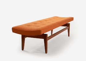
Without really planning it, this second post of the series is about another of my favorite designers, Jens Risom. My original premise was that even great designers have ill-conceived or poorly executed ideas, and I have an example residing in my own home.
At his best, Risom has produced furniture with the most gorgeous bases I've ever seen, including some that make the tabletop, chair or sofa seem to float. Take a look at some of these stunning designs.
 |
| Comfort Conscience lounge chairs...a definite SUCCESS circamodern.com |
 |
| Floating bench...another SUCCESS 1stdibs.com |
 |
| Lounge chair floating on a three-legged base 1stdibs.com |
 |
| Floating coffee table...YES! |
 |
| My Jens Risom credenza...a KEEPER! |
Take, on the other hand, the tables I have in my home. They have beautiful bases. Unfortunately, you can't see them without practically lying on the floor. The table tops extend almost 4.5 inches (11.4 cm) beyond the bases and are simply too large. Couple that with the fact that the tables are extremely low, and even someone who's 5'3" like I am has problems seeing what's underneath. As a result, the bases that were designed to make the tabletops appear to float are hidden and seem crushed under the weight of the massive tops.
Remember the Wendy's commercial in the 1980s featuring Clara Peller asking, "Where's the beef?" That's how I feel about the bases when I look at my tables.
 |
| My table...Where's the base? This has to go down as a FAIL. |
 |
| The same table taken from a better angle See, it really does have a beautiful base under there. worthpoint.com |

As they say in the fashion world, you can't flash cleavage and legs at the same time, it's one or the other! Mr Risom needs a gentle reminder then! :)
ReplyDeleteBut really Dana what an issue to have, we must show compassion and forgive!
As much as I love Risom designs, it's easy to forgive him this little mistake. At some point, when the boys are older, I'll probably replace the tops with a piece of glass.
DeleteI love those chairs! Were they comfy, I wonder?
ReplyDeleteOh, I bet they are! I'd hate to think that anything that beautiful could be less than heavenly to sit in.
DeleteThey are pretty cool tables. But I do appreciate your pointing out designer FAILS. It will sharpen my aesthetic eye.
ReplyDeleteI think most of us, when we first start to collect mid-century pieces, get excited when we find something at a good price by a well-known designer and buy it without asking ourselves, "Is this really good design?" That's how we came to have these tables. The truth is that our beloved icons of the MCM era were mere mortals (gasp!) and could turn out a design that didn't work as well as some of their others. I will say, they've been wonderful for the grandsons. The tops are so big that they actually sit on the table to color...haha We did sell one of these to a couple who promptly took the top off and replaced it with glass, which solved the design problem instantly.
DeleteWhen I read the title of this post and saw the first pic, I was like "what is wrong with those chairs!" I thought you'd lost the plot Dana, because for the life of me, I couldn't find anything I didn't love about them. Silly me! Of course I read on, and got what you are talking about. Durr!
ReplyDeleteMy Parker dining table is kind-of a fail too really, it has the most lovely interesting base under it's top, but unless you bend down and look for it you wouldn't know it was there. Still love it, but it's almost a bit of a waste...
I wondered if anyone would wonder why I included Risom's great designs in this post...:)
DeleteIt's a shame, really, when a beautiful base is hidden under a table top. I'm not sure what the designers were thinking.
This is one of the most creative and sensible styles I've come across when it comes to designer furniture. It does give off the impression that it's floating with some clever use of thin but durable materials as base. Also the use of materials for the seat itself perhaps or any main part of the furniture has its incredible level of comfort and convenience.
ReplyDeleteYes, Risom's designs are beautiful and functional.
Delete