Flickr Widget

Sunday, June 30, 2013

The missing room: Laundry room/walk-in closet

When I did the big reveal of the "modernist nest," there was one room I didn't photograph...the laundry room/walk-in closet. Once I moved in, I decided to make some changes that I thought would result in a more efficient and attractive space, so I was in the middle of those alterations when I showed you my new home. Admittedly, it's the least exciting spot in the house, but several people have asked about the "missing room," so I thought I'd give you a peek.

For those of you new to the blog, several months ago I invited my daughter, son-in-law and two grandsons to move into my primary residence, and I designed a secondary suite for myself behind the main house where a freestanding carport and large workshop originally stood.

The room is 12.5 feet (3.8 meters) long and about 7.5 feet (2.3 meters) wide...the same length and only a foot narrower than my kitchen. One wall houses the washer and dryer in an partitioned nook at one end, as well as a large closet with a pair of bi-fold doors that conceal a broom closet with storage on one end and the hot water heater and air conditioning unit on the other. The opposite side of the room also has a partitioned nook with shelving. The rest is closet space.
I designed the apartment to simplify my life, and one of the things I did that helped streamline chores was to eliminate the traditional bedroom closet and put a clothes rod, shoe bags, handbag hooks and chest of drawers in the laundry room. Now, instead of taking clothes to the bedroom, I get them out of the dryer and simply turn around to hang them or put them in drawers...a handy little time-saver. Out-of-season clothes are stored in decorative plastic bins above the clothes rod.

I originally had a three-tiered chrome cart that I planned to put laundry baskets on, but it turned out that I liked the concept much more than I liked the reality, so I moved the cart to the patio to provide a workspace for grilling and a handy place to stash outdoor toys. To replace the cart in the laundry/closet, my daughter and I built deep pull-out shelves that hold infrequently used items in back and laundry baskets in front. I painted the shelves black for a little interest against the white walls and chose black closet accessories, such as shoe bags and hangers. The DIY project only cost about $50, but it gave me a good bit more storage space and a better system for sorting laundry.

The finished space is much better organized, and it has a less utilitarian look than it did before.


Combination laundry room/closet
with four new pull-out shelves and bins for out-of-season clothes

Close-up of  three Piet Hein grooks hung between
two sets of bi-fold doors (broom closet and a/c closet)


Labeled laundry baskets
 in a much smaller size than I've ever used...
to encourage doing smaller loads
so laundry day isn't a huge chore.

Ironing station on the dryer
for touch-ups when I don't want to set up the board
(I discovered the magnetic ironing pad on Pinterest. It's great!)

Saturday, June 29, 2013

Too much monkey business

My latest eBay purchases have arrived, and I'm so excited that I had to share them with you.

After seeing Nick's Zoo Line find and then learning about Robin and Blake's collection, I knew I had to find a wooden monkey for myself...but I never expected two for the price of one. That's exactly what happened though. I was scouring the listings and saw a pair of primates priced low and described as being in very good condition, but wait...the listing also had the Best Offer feature, so I submitted an offer for $15 less, and it was accepted almost immediately. (I also placed a bid on a lot of four that started at $19.50...two large and two small...but three of the four had flaws, so when the bidding got too high, I dropped out.)

Here are the two monkeys who recently joined my household. I gave them a little teak oil pick-me-up, and now they're all settled in my laundry room/walk-in closet. (That's the only room of my house that I didn't show in the reveal of my new "modernist nest," because it wasn't quite decorated/organized to my satisfaction. It's finally done, and photos will follow tomorrow.)

Zoo Line, do you think? Any information would be appreciated.


These two have made themselves right at home on my chest in my closet/laundry room.

I like to think they've been together for quite a long time.

I love the color and the facial expression of this little guy.

And I love the indefatigable spirit of this pigeon-toed fellow,
 who keeps going, in spite of losing his tail.


Google Reader shuts down on July 1, 2013.
Follow on Bloglovin

Friday, June 28, 2013

Dorothy Liebes

Dorothy Liebes (1897-1972) grew up in Santa Rosa, California. After finishing high school, she taught art for one year, then studied anthropology, art and teaching at San Jose State Teacher's College and at the University of California at Berkeley, where she received a degree in 1921. While there she was encouraged to pursue weaving, so she bought a small portable loom and taught herself.

She then studied weaving and design, first at Hull House in Chicago and then at Columbia University and the California School of Fine Arts. By selling small handwoven articles, she earned enough money to visit European museums and weavers.

In 1928 she married Leon Liebes, a businessman who sponsored several young artists. He gave his wife studio space in the building that housed his store and encouraged her to experiment. Her first group show was in 1933 at the Decorator's Club in New York City. In 1934 she started Dorothy Liebes Design, Inc., of San Francisco and received her first major commissions from the Ahwahnee Hotel in the Yosemite Valley and the San Francisco Stock Exchange Club.

She was named director of the influential Fine Arts Exhibit of the 1939 San Francisco World's Fair, and began winning awards and having shows in the United States and abroad.

In 1940 she and Leon Liebes divorced. In 1948 she married Pulitzer Prize-winning journalist Relman Morin, but she retained the surname of Liebes professionally.

When Liebes began weaving, most weavers were only producing standard cloth, such as twill, plain weaves and damasks of cotton, wool, silk or linen. But Liebes saw weaving as an art and used not only yarn but also strings of beads, strips of bamboo, cellophane, leather, metallic threads, straw and metal rods. She also used unconventional colors, such as lacquer red, chartreuse, fuchsia, tangerine and turquoise. She said, "There are no bad colors, only bad combinations of colors."

She created colorful window shades, rugs, upholstery fabric and draperies, as well as sculptural weavings. Her weaves became the standard complement to modern architecture, and she became known as "the mother of modern weaving." She was commissioned by architects Frank Lloyd Wright, Edward Durell Stone and Samuel Marx, and she was a design consultant for companies such as DuPont and Dow, assisting in the development of machinery that could replicate the aesthetic irregularities of hand-loomed fabrics.

From whoislog.info and Notable American Women: The Modern Period: a Biographical Dictionary, edited by Barbara Sicherman and Carol Hurd Green


Textile sample
metmuseum.org

Textile sample
metmuseum.org

Textile sample
metmuseum.org

Textile sample
metmuseum.org


Textile sample
metmuseum.org

Window blind sample
metmuseum.org

Window blind sample
metmuseum.org

Window blind sample
metmuseum.org

Window blind sample
metmuseum.org

Window blind sample
metmuseum.org

Window blind sample
aaa.si.edu

Window blind sample
metmuseum.org

Kashmir tile for Pomona Tile Manufacturing Company
1stdibs.com


Google Reader shuts down on July 1, 2013.
Follow on Bloglovin

Thursday, June 27, 2013

Fort Worth modernist home is razed

I love many things about Fort Worth, Texas...my hometown. The propensity of many of its residents to tear down architecturally significant residences and replace them with McMansions is not one of those things. Knowing this, a regular reader of this blog emailed me about the bad news coming out of Texas before I even had time to write this post.

After the brouhaha that arose when an A. Quincy Jones house owned by Amon Carter III was threatened with the wrecking ball recently and only narrowly escaped demolition, another house belonging to a member of the Carter family is in the news. This time the house wasn't saved.

Home for more than 50 years to the late Ruth Carter Stevenson, who died in January 2013, the structure was designed in 1956 by architect Harwell Hamilton Harris. A California native, Harris worked for Richard Neutra early in his career. Later he was part of a group of young modernists who were friends with John Entenza, publisher of the magazing Arts & Architecture, sponsor of the Case Study House Program. He was also influenced by the work of Frank Lloyd Wright, and the Ruth Carter Stevenson house was modeled after Wright's famed Hollyhock House in Los Angeles. Harris left his position as head of the architecture program at the University of Texas at Austin when he accepted the commission for the Stevenson home.

The exterior of the house was creamy coral brick, stucco and redwood, and it was set along a ridge. Inside it had an atrium and a material palette of peg board, cord and warm wood. The stunning landscaping was designed by Thomas Church, a preeminent mid-century landscape architect from San Francisco. The gardens began formally, but became more naturalistic as they moved away from the house, falling down to a creek running along the property. In 2000, it was awarded the 25 Year Award by the Fort Worth Chapter of the American Institute of Architects.

The new owners, identified in the Fort Worth Star-Telegram as Ardon and Iris Moore, had the house destroyed before a campaign could be mounted to save it. Mark Gunderson, a Fort Worth architect and friend of Ruth Carter Stevenson said, "I'm really amazed that the estate let it be sold to someone whose intention was almost certain to tear the house down. It's inconceivable to me that the new owner would do that."

Gunderson went on to say, “When showing the most important architectural work in the city to visiting dignitaries—noted architects, artists, writers and others—Ruth’s house is easily one of the six or so most significant structures in Fort Worth."

“Even in a city as conservative as Fort Worth, with its seeming ‘anti-modern’ bias, her house and garden remains a quiet, unostentatious, understated oasis and its loss would be a travesty,” the architect said before learning it was demolished. “It is sad commentary on the lack of appreciation for architecture and landscape in a place containing a handful of the best examples in the world.”

The demolition occurred June 20-21, 2013, immediately after an appeal to spare the home by the Texas Society of Architects, and has sparked bitter debate between preservationists and those who believe an attempt at preservation is an infringement on property rights.

From star-telegram.com and artsblog.dallasnews.com


Photo by W. Mark Gunderson , AIA
All this...gone forever
star-telegram.com

Photo by W. Mark Gunderson, AIA
And this...demolished
star-telegram.com

Photo by W. Mark Gunderson, AIA
All that is left standing...a greenhouse on the edge of the property
star-telegram.com


Update (6/29/2013):  I guess it shouldn't surprise me, yet I never cease to be dismayed and even a little shocked by the cavalier attitude that people have about historical architecture, especially when there's quick money to be made. The Fort Worth Star-Telegram reported that Kate Johnson, the youngest daughter of Ruth Carter Stevenson, said her mother's home sold two days after it was listed and insisted there was no historical for either her mother's home or for the home of her grandfather, which is slated for demolition too. 

Despite what Historic Fort Worth Inc. (co-founded by her late mother) and many others have said, she adamantly supported the new owners' right to tear down the house. When asked if she was aware of their intentions, she said, "I wouldn't pry. What people do with their private property is nobody's business." 

Read more here: http://www.star-telegram.com/2013/06/21/4955993/two-carter-homes-in-rivercrest.html#storylink=cpy


Wednesday, June 26, 2013

Harry Bertoia Centennial Table Tonal

Harry Bertoia (1915-1978) was a metal sculptor, jeweler, graphic artist, and furniture designer best known for the Knoll Bertoia wire chairs. His sounding sculptures were composed of a dense cluster of stainless steel rods welded to a base, which were "played" by running a hand along the top. Bertoia, along with his contemporaries Charles Eames, Eero Saarinen, George Nakashima and others, changed America’s approach to art and design.

For the first time, the Bertoia Estate now offers an exact reproduction of a tonal sculpture from Bertoia’s most popular style, which he and his son Val created together in the 1970s. The original stands with about a hundred other tonals in the Pennsylvania "Sonambient barn". (Somnambient was Bertoia's term to describe the spatial and tonal environment created by these sound sculptures.)


Harry Bertoia with some of his sculptures
dailyicon.com

Original large Bertoia Sonambient sculpture
1stdibs.com

Smaller original Sonambient sculpture
middlebury.edu

Bertoia barn - Barto, PA
lesliewilliamson.com


Check out the video. Celia Bertoia tells you a little about her father and lets you hear the Table Tonal. They are absolutely amazing, and I'd love for us to get one for the store!


Information about Bertoia and the new Table Tonal from Celia Bertoia
harrybertoia.org

Tuesday, June 25, 2013

In the pop-up shop: Platner potential

The latest acquisition to cause a stir on our Facebook page are this bronze lounge chair and ottoman designed by Warren Platner for Knoll. They are a bit faded and need to be reupholstered, but when that is done, they will truly be showstoppers.


Bronze lounge chair and ottoman by Warren Platner for Knoll


What's really exciting is imagining what these pieces are going to look like if they're redone in this Knoll boucle fabric in Pearl. I think the nubby almost-white fabric is going to look sensational against that dark bronze wire. Of course, if I were restoring it for myself, I'd be tempted by the chartreuse. What color would you choose?


Google Reader shuts down on July 1, 2013.
Follow on Bloglovin


Monday, June 24, 2013

Google Reader: Going, going, almost gone

Are you ready for July 1, when Google Reader ceases to exist? How will you keep up with your favorite blogs? How will you encourage your readers to follow you?

You super-techie types probably figured that out as soon as Google announced that it was going to pull the plug on Google Reader several months ago. But if you're like me, you've probably tried to stay in denial as long as possible. However, as I've been told by a few not-ready-for-stand-up-comedy friends, denial is just a river in Egypt...and when July 1 gets here, we'd better have a Plan B, or we will lose our data after a three-month sunset period.

A few days ago, I finally decided to face the reality that Google is, in fact, retiring Google Reader, so I started trying out a few of the alternative RSS readers. (For you seriously non-techie types who still have all your favorite blogs bookmarked separately, an RSS reader ...also known as a feed aggregator...is a service or software tool that keeps track of the most recent updates to your favorite blogs, podcasts and websites. Instead of having to visit each website to check for updates, you can use an RSS reader that will let you know when there is new content.)

I tried several, but my two top picks were Bloglovin' and Feedly*. I found them both visually appealing. Bloglovin' gives you a snippet of the post, along with a choice of a horizontal magazine view with a small image (similar to Google Reader) or a vertical card view with a large image (similar to Pinterest). Feedly gives you more options, offering a title/text only view, a magazine view, a card view or a full article view.

Although I really liked the Feedly, in the end I chose to go with Bloglovin', because I found it slightly easier to use. Also, it's extremely simple to add Bloglovin' widgets to your blog. You just go to this page, type in your blog's URL, and the rest of the work is done for you. (I kept getting an error message when I tried to add a Feedly button to my blog.)

But how easy is it to transfer your favorite blogs from Google Reader to Bloglovin'? It's almost effortless. (The same is true of Feedly.) To make the switch to Bloglovin', you simply go to this page and click a button. Also, to make it easy if you've never officially become a follower of this blog but would like to start now, I've installed a Bloglovin' button in the right-hand navigation bar.

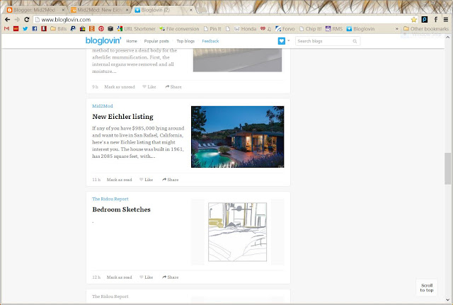
Once you're all set up, here's how your Bloglovin' feed will look:


Small image version of Bloglovin'

Large image version of Bloglovin'


I may continue to use both Bloglovin' and Feedly for a while to get to know both of them better. I still have a concern that Bloglovin' doesn't update as quickly as Feedly does, as I've found posts on Feedly that weren't showing up on Bloglovin', even after refreshing. And I still want to become more familiar with the ins and outs of leaving comments on both (because I haven't found that to be as simple as on Google Reader) and  figure out why I have to Ctrl-click to leave comments sometimes.

At least now I don't have that dreaded change hanging over my head though. You might want to start experimenting with new RSS readers soon too, rather than wait till July 1, so you don't miss any of your favorite blog posts trying to figure out how to access them.  Denial is really never very effective, is it?


********************


*For a thorough and more tech-savvy comparison of Bloglovin' and Feedly, check out Bloglovin’ vs Feedly: Which RSS Reader Reigns Supreme?

Some other options for Google reader users:

Pulse (www.pulse.me) is a more visual app with a tile interface and features that make it easy to transfer and expand your Google Reader subscriptions.  (Dana's note: My daughter loves Pulse, but  I don't find it user friendly.)

The Old Reader (http://theoldreader.com) is a bare-bones, text-based app that gets the job done.  (Dana's note: Just not pretty enough)

Yahoo's My Yahoo (http://my.yahoo.com/) will display updates from favorite blogs alongside your Yahoo mail, local weather and other services. But adding feeds is a laborious process and the display isn't very useful.  (Dana's note: Too much work)

WordPress, which lets you create your own blog, also lets you transfer Reader feeds and track updates from blogs around the Web (http://en.support.wordpress.com/reader/). But its visual design is better for leisurely browsing rather than efficient scanning.

Flipboard, likewise, has won many fans for its magazine-style, touch-screen interface. It's easy to transfer Google Reader feeds on a tablet (http://inside.flipboard.com/2013/03/14/weve-got-your-rss-covered-save-your-google-reader-feeds-now/), but difficult to use on a desktop. A representative said Flipboard plans more Reader-style options soon.

Digg has promised to release a reader (http://blog.digg.com/post/45355701332/were-building-a-reader) as an add-on feature to its current site, which lets users share articles and vote on how they're ranked.
Source: Mercury News reporting


Follow on Bloglovin

Sunday, June 23, 2013

New Eichler listing

If any of you have $985,000 lying around and want to live in San Rafael, California, here's a new Eichler listing that might interest you. The house was built in 1961, has 2085 square feet, with four bedrooms and two bathrooms. It backs up to an open space and has a salt water pool.  Inside it has a grand entryway with skylights, tile floors and updated kitchen and bathrooms.

I know some of you think that modernizing kitchens and bathrooms to this extent is a sacrilege, but as I've said before, I was alive when mid-century homes were new. I've paid my dues using a toothbrush to scrub white grout in pink bathrooms, hand-drying dishes every night because we didn't have a dishwasher and living with Formica that has been permanently stained with Kool-Aid. I love the mix of vintage and new, so I'm fine with modern conveniences as long as they're thoughtfully and tastefully done...and I think these are.

From marinmodern.com


1002 Del Ganado Road, San Rafael, California

Yellow, gray and white exterior

Pool view by day

Entryway with skylights

Living room with stacked rock fireplace
Extra seating area with built-in shelving
View to the extra seating area and dining area

Bedroom

Bedroom

Office

Master bath

Kitchen

Follow on Bloglovin