Flickr Widget

Monday, December 31, 2012

Not pink

As much as I love mid-century design, I'm not a purist like some of you are. I know there's a movement afoot to save the pink bathroom, and I applaud those of you who march under that banner, but the last home my parents bought in the 1960s, before I married and moved away, had a pink bathroom...and a mint green one too...both with matching fixtures, so I have a bit of a "been there, done that" attitude about vintage bathrooms.

When I bought my little 1950 house, it had been restored by the previous owner in a style better described as "modern" than "mid-century." The kitchen, dining room and living room alcove floors had been done in slate, and then, almost as if an afterthought (or as if the money had run out and the homeowner had made a run to Builders' Surplus to grab whatever they had on hand), the bathroom had been done in an inexpensive mish-mash of cream colored tile. The floors and the shower walls were that "close, but no cigar" attempt to match.  It would have been so much better to use contrasting materials than two tiles that almost matched.

Then he threw in a cream colored marble vanity top that was yet another shade, which made the whole effect even more confusing...and blah. It was truly the only room in the house that I didn't love. Oh...and did I mention that he didn't even finish tiling in the bathroom linen closet? I guess he ran out of materials and just closed the door and pretended it was done.

Since our Christmas snow delayed starting my apartment, I decided to do a quick redo of the bathroom in the house before moving forward with the bigger project. I chose porcelain tile that replicates the real slate flooring in the rest of the house perfectly, and then chose a travertine trim for the shower to make the existing cream-colored vanity countertop make sense. I chose to tile the tub/shower enclosure all the way to the ceiling, rather than stop 7" short like the previous owner did...another decision he made that looked as if he had simply run out of tile.

I'm pleased with the results and plan to use the same tile in my apartment so it looks like an extension of the main house and doesn't repeat the mish-mash look the bathroom formerly had. I've ordered black appliances for the kitchen, light countertops flecked with black and browns with matte black sinks and faucets. All my lighting will be Tom Dixon style Beat pendants in matte black.

My contractor and all the sub-contractors are going to enjoy New Year's Eve and Day with their friends and families, and then we're going to hit the ground running on the apartment on Wednesday, so I'll probably be able to give you some before and after shots when the demolition is done.


Oh, by the way...Rebecca at Mid-Century Modern Remodel is having a drawing for a beautiful turquoise vase, and she wants your input on a new masthead for her blog. Drop by and spread the bloglove.

Thursday, December 27, 2012

New posting schedule*

Since September 6, 2010, I've written at least one post a day. (This is the 907th, to be precise.) When I was living alone, that was sometimes a stretch, because I posted even when I was sick or busy with the store or doing a special project for the school district. Now that I have my extended family here with me, it's becoming increasingly difficult to continue doing that.

Many people have asked me how I manage daily posting, and lately I've begun to ask myself the same question. As much as I appreciate my readers and enjoy writing, playing with my grandsons is more important...and more fun...than researching designers and architects, so I've made a decision to start posting on Mondays and Thursdays.

Of course, if something special comes up, or if I find time to post on additional days, I won't hesitate. I'll still be reading and commenting on other blogs every day. I just won't be keeping up the frantic pace of posting that often myself.

I had planned to post today about the first day of work on my new apartment, but we had a white Christmas, which carried over into Demolition Day, so work was delayed. I promise I'll have an update when I post again Monday.

Till then, let's all enjoy what's left of the holiday season, as we get ready for New Year's Eve and New Year's Day.

Oh, by the way...Rebecca at Mid-Century Modern Remodel is having a drawing for a beautiful turquoise vase, and she wants your input on a new masthead for her blog. Drop by and spread the bloglove.


*UPDATE: It's now April of 2016...1672 posts since I started in 2010...and these days I'm posting a couple of times a week, usually on Wednesdays and Saturdays.

Wednesday, December 26, 2012

Alexandre Noll

Alexandre Noll
Alexandre Noll (1890-1970) was born in the Alsace region of France and was not involved in art until the 1920s. During World War I, he sketched, did watercolors but primarily made woodcuts. After the war was over, he began sculpting, starting with umbrella handles and lamp feet for couturier Paul Poiret.

In 1925 he took part in the International Exhibition of Modern Decorative and Industrial Arts, outlining a series of sculpted objects. In 1935 he began his "furniture sculptures," which were carved into sycamore, mahogany, teak and ebony. He participated in the 1937 International Exhibition of Arts and Techniques, showing a few small pieces. In 1939 he showed at the Salon des Artistes Decorators and the seventh Milan Triennale in 1940.

During World War II, Noll designed furniture and forged his style and was ready to produce his unique furniture by the time the war ended, but by the 1950s,  Noll had returned to sculpture and took part in numerous exhibitions in France.

He is known for his natural style, his purity of form and in an approach that was both poetic and philosophically intuitive.

From chastel-marechal.com


Sculpture
icollector.com

Sculpture
kaufmann-mercantile.com

Sculpture
liveauctioneers.com

Pitcher
1stdibs.com

Dining table
arcadja.com

Cabinet
cristinegrajalesinc.com

Cabinet
liveauctioneers.com

Table
modern-furniture.de

Table
hollywoodathome.com

Chair
wright20.com

Lamps
referencelibrary.blogspot.com

Tuesday, December 25, 2012

Construction saga: The eve of destruction

This little structure, built in 1950, is about to be taken completely down to the studs, but in a month or so, it will morph into something more beautiful than the original owner of the house ever imagined.

I meant to get out earlier today and take a picture of the workshop/storage building/carport that is about to be magically transformed into my little modernist nest, to quote fellow blogger Brismod.

It was almost dark when I remembered to take the photo, and perhaps that is fitting. Bright and early tomorrow morning, the crew will be here to start demolition on the interior and start jackhammering concrete in the carport so plumbing lines can be laid and new concrete poured.

The well-worn doors will be replaced by French doors, and the carport will be my kitchen and laundry room. The sidewalk and grassy area in front will be paved with stone to create a small seating area, the teak bench will be sanded back to its original glory, and I'm planning a great modern overhang which I'll post about later.


This will be my little flat-roofed modernist home in just a few weeks, and I'm incredibly excited. I found a great sale on appliances and ordered my refrigerator, stove, dishwasher and over-the-range microwave last night. The fun will begin when they're all delivered and we have them sitting in the living room.

We are in the last stages of cleaning out all the things that were stored inside the building and in the carport. (We're down to one last box and my SIL's weights.) I posted an ad for a ton of free things on craigslist, and the first person who showed up took every single item.

I'm ready to get this started!

Monday, December 24, 2012

Happy Holidays!


From all of us to all of you...
Here's wishing you the happiest of holidays.

Dana
Jenn
Joe
Holden
&
Grayson


Image from rockscissorpaper.stores.yahoo.net

Sunday, December 23, 2012

And speaking of construction...

I know a number of you have been feeling festive and constructing beautiful gingerbread houses lately, so I thought I would share ours with you.

I say "ours," but I think it's only fair to issue a disclaimer. I was a bystander. My daughter and SIL, as young parents, were attempting the project for the first time and didn't really know what to expect. I, on the other hand, knew from experience to take a seat across the room, have my camera ready, critique their work and laugh...a lot. Luckily, I was far enough away that I wasn't part of the food fight that erupted when the house collapsed. Giving credit where it is due, my daughter and SIL did foresee that this had the potential for being a very messy endeavor...thus the quilt on the sofa, the pre-bath bedheads and PJs and, in the case of Grandson #1, a fashionable underwear and socks ensemble.


Construction progressed well enough at first

Mom started to show some signs of consternation fairly quickly,
although Grandson #1 did a carefree underwear dance.

The instructions finally had to be consulted.

Then Dad started getting a little rowdy with the frosting, and everyone joined in an epic food fight.
Somehow Grandson #2 lost a sock in the melee.

By the third roofslide, the house parts were fair game.
But everyone was soon in near-sugar coma, so it didn't matter anymore.

Saturday, December 22, 2012

Construction saga: Let the fun begin!

I've been talking about a construction project in the planning stages for a while, but now it's really happening.

I have a large freestanding workshop/storage building/carport behind my house which will soon be turned into a beautiful apartment...for me. My daughter, SIL and the grandsons will be living in the house. For a long time, we've been joking that when I get old, I would live in an apartment in their back yard. We never expected it to be quite this soon, but when they decided to move from Dallas back to Fort Worth, things fell into place, and we realized that this would be a good move for us now.

I envision its being my own little oasis of modernist goodness...with about half the square footage to keep clean, which was the deciding factor for me. I realized that you don't have to be old to be tired of cleaning rooms you don't use. The apartment will be the perfect size for me, and I'll get to build in some amenities that I don't have in my house at the moment.

I've spent hours looking at sinks and toilets and flooring and paint, and I've made almost all of my final choices. Here's just a hint of some of the materials I'll be using.


And, no, I can't justify a $1000 ceiling fan...but it was nice daydreaming about buying one.

The exterior color scheme will be the same as the main house...grayish green with orange trim. I'll have French doors instead of a solid wood front door, so the orange will be used on a 3" strip of metal beneath the flat roof. I'm still debating whether the interior walls will be bright white or will have a very faint gray-green cast. 

This saga will continue for at least a couple of months, assuming the weather cooperates and the work goes as scheduled, so I'll keep you posted as things progress. 


Friday, December 21, 2012

Barcelona, Barcelona

The other day my SIL came home with a black Barcelona chair and ottoman. While it isn't a Knoll chair, it is a very old Italian chair, probably from the 1960s, as evidenced by the flathead screws and the old label.


Italian leather Barcelona style chair and ottoman

The next day he picked up a gorgeous Knoll version in white. This one has the Knoll signature stainless steel frame.


Knoll Barcelona chair by Mies van der Rohe

Thursday, December 20, 2012

30% OFF ALL VINTAGE MODERN

For those of you in the area, my SIL just announced a great end-of-year sale. He's offering 30% off every vintage modern item in the store from now until December 31.

The store will be closed from December 23 until January 2, but we will be available by appointment every day except Christmas Day and New Year's Day.

Vintage gift picks by Nate Berkus

Imagine my surprise when I was scrolling through Nate Berkus's Vintage Gift Guide and found one of our items listed!

The Divided Forms sculpture by David Anderson was Nate's pick #13. The piece is 9" high x 24"wide x 16"deep (22.9cm high x 61cm wide x 40.6cm deep) and is beautifully organic.

Merry Christmas to us!

Divided Forms by David Anderson

Wednesday, December 19, 2012

Pull up a saucer

The latest chair to be featured in the store is a vintage saucer in a beautiful orange upholstery. This piece has beautiful lines and has already garnered a good bit of attention on our Facebook page.

Kinda makes you want to pull up a chair and get comfortable, doesn't it?


Monday, December 17, 2012

Cory Buckner: Inside the mind of a great man

At the end of World War II, returning soldiers were faced with housing shortages, and, across the country, affordable communities of affordable housing began to spring up. Among them was the Mutual Housing Association  in the hills above Santa Monica, California.

In 1946 four men pooled their resources and formed the Cooperative Housing Group, with the intention of building four homes around a shared pool and playground. The idea mushroomed and soon there were 500 members, each paying a $25 membership fee and making quarterly deposits of $500 in order to form a cooperative community. By 1947 the group had a board of directors and a credit union in place, and the MHA was formed. Eight hundred acres of land near Santa Monica was divided into 350 lots, and Whitney R. Smith and A. Quincy Jones, and an engineer, Edgardo Contini were selected to design the neighborhood, beginning with the architect's site office and a communal day care center.  Garrett Eckbo was chosen as the landscape architect for the neighborhood. Eventually, 150 houses were completed, and in 1956, the site office—which the architects worked out of for nearly a decade—was converted into a home. In 1961 a fire took out 45 of the homes, and numerous others were torn down or drastically altered.

Fast-forward to 1993, when Cory Buckner and her husband Nick Roberts purchase the former site office tor their home in the neighborhood now known as Crestwood Hills. At first she unsuccessfully tried to have the area designated as a historic preservation zone but decided to get individual houses declared historic monuments. And with the help of the late Julius Shulman and Elaine Sewell Jones, A. Quincy Jones's widow, she has done just that. Fifteen of the homes now have historic designation.

As a result of her work with Crestwood Hills, Buckner has written a monograph about A. Quincy Jones and has preserved a significant portion of California modernism. She says her hard work has been a small price to pay for "living inside the mind of a great man."

From dwell.com
All images from dwell.com


Buckner-Roberts home

Driveway

Kitchen

Living room

Living room

Patio/dining room

Sunday, December 16, 2012

Ho ho ho

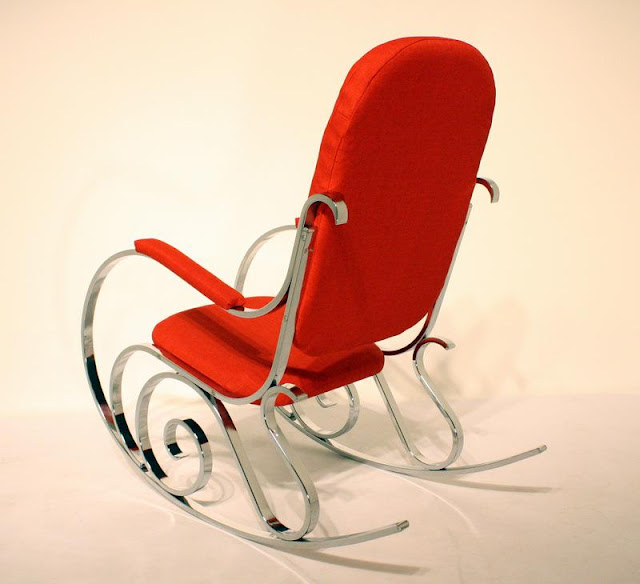
My SIL ran across this French Maison Jansen chrome-based chair from the 1960s at a price too good to pass up. While it's definitely not the type thing we usually carry in the store, it is an interesting take on the classic Thonet bentwood rocker...and if worse comes to worse, we can always rent it out for pictures with Santa Claus. :)


Maison Jansen rocker


Saturday, December 15, 2012

Wedge magazine table by John Keal

You might remember the Wedge magazine table by John Keal that we had refinished a while back. Now we have a second one in the original striped mahogany, and it's as beautiful as its predecessor. Keal designed this piece for Brown Saltman. I love the shape of this table...and anything that holds magazines is all right by me.


Wedge magazine table by John Keal for Brown Saltman


Friday, December 14, 2012

Modern ceiling fans

It's been said that a good man is hard to find, but I've found it even harder to find a good modern ceiling fan. Until now, that is. The Haiku fan and the Sycamore fan have dispelled all my preconceived notions.

The Haiku website shows a picture of a traditional ceiling fan deconstructing to reveal their innovative design underneath, and that image says it all. The Haiku completely shatters the ceiling fan mold, which is exactly the type of fan I've been looking for.


Haiku fan
coolgizmotoys.com

Haiku fan
gearculture.com

The Sycamore fan is even less like a traditional ceiling fan. In fact, it looks like something you'd find in a home of the future...and I love it too.


Sycamore fan
getprice.com.au

Sycamore fan
mhc.net.au