Flickr Widget

Showing posts sorted by date for query iroquois. Sort by relevance Show all posts

Friday, November 7, 2014

Black Chutney

Temptation comes out of the blue sometimes. I recently received an email from a woman whose mother is downsizing and would like to sell 74 pieces of Russel Wright American Modern in black chutney, which is considered a high end color in the AM line, along with cedar and seafoam.

I have to tell you that I thought long and hard about buying it for myself, but I have 55 pieces of Iroquois Casual listed on Craigslist as we speak, simply because I don't have room to store it, so I finally had to admit to myself that buying 74 more pieces wasn't a good idea, no matter how enticing the offer. (Trust me, the price she's asking is more than fair!)

The owner bought the set in 1953, when she was a newlywed. According to a daughter, it wasn't their everyday china, so it's in good condition.

If you're interested in buying it for yourself, you can contact Marla at azmama@cox.net. (You do realize that I gave you that email address grudgingly, don't you? The lug bowls alone are still calling my name.)


Monday, August 18, 2014

After Dinner Coffee Pot? Check!!!

I have a board on Pinterest called Things to Buy Before I Die. Maybe that title is a little more morbid for a 66-year-old than for a 26-year-old, but I don't intend for it to be. It just means there's a little more pressure to find bargains on the items on my ultimate shopping list.

My list is actually quite short, and it became shorter still with an eBay win over the weekend. I have a fairly extensive collection of Russel Wright Iroquois Casual china in ripe apricot, and I've had the after dinner coffee pot on my list for a long time.

Several days ago, I saw one at an incredible price and put it on my watch list. It had just been listed, and I figured the price was going to be bid up to more than I wanted to spend, but I decided to keep an eye on it. When there were only 13 hours left in the auction, I decided to put in a very low bid, and I won!!!

Here's a stock photo from a replacement company. The seller's photo wasn't as pretty, and I was too excited to wait to post about this latest win.


replacements.com

Tuesday, August 5, 2014

Restaurant Ware Collectors Network

Most of us have run across pieces of restaurant ware at estate sales or online. I'm certainly no expert on the topic, but I get questions about it frequently, and I admit I'd like to learn more.

Lucky for us, there are experts out there, and they have a website that may help you solve some of your restaurant ware mysteries. Restaurant Ware Collectors Network offers a forum, a great IDwiki, a fantastic collection of date codes and backstamps photos, and a list of links by category...including restaurant ware shops and eBay sellers, pattern identification and research, personal collections, transportation and military china, and manufacturers.

Here are a few examples of what you can find on the site. It's worth a look.


Cup of Joe on the Go
The Museum of Vintage Cups

Red Fox Restaurant
Little Spoon's Virtual Museum of Restaurant China

Display of flip-top bowls
The Phillips-DeGrafft Flip-Top Collection

A sample of Jackson China backstamps

A sample of Iroquois China date codes

Friday, July 26, 2013

Modern finds: Buddha and Ooma bowls

I love to mix vintage modern with new modern design. It's such a seamless match-up.

The latest addition to my list of things to buy are Buddha bowls. These functional and beautiful bowls are designed to fit into the palm of your hand and have a convenient hole for your thumb.

Although the color selection varies from store to store, I've seen them in tofu (white), olive, black bean (black), shitake (brown), aubergine, buttercream, Pacific (bright aqua blue), saltwater taffy (light turquoise), Moroccan (deep blue), Provence (dark cobalt), green curry (light) and snowpea (bright green). I want a set of four in tofu, but they would be fun to mix and match. The best selection of colors can be found at Flavour Design, but their price is $32, while most stores have them for $28.

I also found the divided Ooma bowl in the latest Uncommon Goods catalog. These are designed to rest on your hand, with your thumb on top. They would be so handy for parties or for having a few chips and your favorite dip in front of the flat screen. These bowls sell for $25.

And see how great they look with Russel Wright Iroquois Casual?


Buddha bowls
vivaterra.com

Sizes available
flavourdesign.com

Ooma bowls
uncommongoods.com

Ooma bowls
uncommongoods.com

Russel Wright Iroquois Casual
replacements.com

Friday, May 10, 2013

Link-up: Corner of My Home

The amazing Australian duo, Kylie of Lucy Violet Vintage and Donna of Hung Up On Retro, have done it again! After all the fun we had when they came up with the idea for The Great Retro Cook-Off (see here and here), they had another brilliant idea...for us to link-up again and share our favorite retro and vintage inspired corners of our homes. I had such a great time making the Swedish Salad Mold for the Retro Cook-Off that I was thrilled to sign up for this linky. I know it will be just as much fun.

Since I moved into my new "modernist nest," I haven't been able to pull off a full reveal yet, since I'm waiting for all the landscaping to be finished before I call someone out to take photographs with a proper lens. (The place is tiny, I tell you, and there's no way I could do it justice with my camera.)

Luckily, getting a few close-up shots didn't prove to be quite as challenging. The things I've photographed for this post will probably be visible only on the periphery of the reveal photos anyway (and some not at all). I think they deserve more love than that, so this link-up gives them their due.

First, let me show you my pared-down collection of china. Before I moved to my new digs, I had a large collection of Russel Wright Iroquois Casual china in avocado yellow and ripe apricot, as well as a few pieces of Russel Wright American Modern in chartreuse and granite gray. I also had several pieces of Ben Seibel Harvest Time by Iroquois. More than 50 pieces of avocado yellow and chartreuse have been packed away and listed on Craigslist. I'm using the ripe apricot Iroquois Casual for my everyday dishes, and I'm displaying serving pieces of Harvest Time, Iroquois Casual and American Modern atop the cabinets in my kitchen, since there's no room in my downsized life for my Drexel Profile china cabinet...a small price to pay for the new apartment's efficiency, ease of maintenance and proximity to my grandsons!


Greater love hath no woman than to bare her kitchen cabinets to her blog friends.
(In case you were wondering, I kept the carafe and the 4-quart lidded casserole!)

And, of course, the samovar and large pitcher made the cut.


Because my new apartment is so small, I had to get creative with the use of space. I opted to have no traditional closets, either in my bedroom or in my bathroom. (My laundry room doubles as a walk-in clothes closet, with a 11' rod and chest of drawers opposite the washer and dryer.)  In the bathroom, an IKEA Expedit stores the usual necessities in Knipsa baskets and also holds towels and part of my collection of vintage birds, with a few other vintage pieces thrown in for good measure.


New Expedit, vintage accessories

Bitossi vase

Vintage glass bird (Dino Martens, perhaps?)

Kingfisher, by Tapio Wirkkala

Vintage hand-carved primitive bird

Vintage candleholders and wooden egg

I hope you'll drop by Donna's and Kylie's blogs and check out all the beautiful corners of all the beautiful homes! You're in for a treat.

Monday, June 25, 2012

Michael Lax

Michael Lax (1929-1999) was born in New York and graduated in 1947 from the New York School of Music and Art. In 1951 he graduated from Alfred University, where he had studied modern ceramics techniques.

In 1954 he won a Fullbright Fellowship to Finland, where he studied Scandinavian design just as it was becoming popular. In 1956 Russel Wright hired him to work on a series of dinnerware designs. After working for Wright, he freelanced until 1960, when he started working on a line of enameled cast-iron cookware for Copco, which was noted for bringing a Scandinavian flair to American design. His 1962 teak-handled teakettle is one of his most famous designs. He continued to work for Copco through the 1980s.

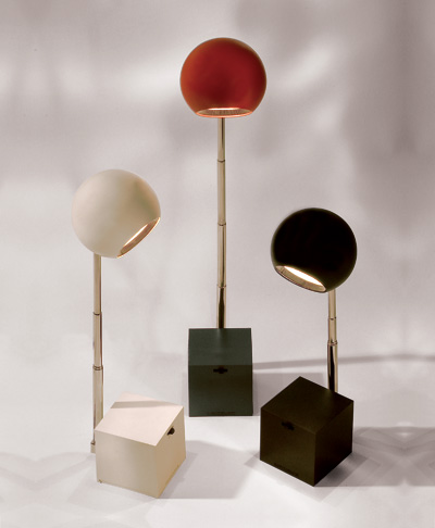
Also during the 1960s he created the Lytegem lamp for Lightolier, which is part of the permanent design collection at the Museum of Modern Art in New York. He also designed for Dansk, Rosenthal, Salton and Dunbar Glass.

In 1977 Lax received a Rome Prize for studing art at the American Academy in Rome. He moved to Italy in 1984 to pursue a career in sculpture. He set up a studio in Pietrasanta to work in marble and cast bronze.

From nytimes.com


Raymor Capri by Hyalyn
moderntimes.1stdibs.com

Raymor Capri martini pitcher by Hyalyn
modish.net

Copco teakettle
papermichelle.com

Copco fondue set
etsy.com - kibster

Primaries casserole for Iroquois China
etsy.com - zetro

Vase by Hyalyn
modish.net
Lytegem high intensity lamps
lightolier.com

Tuesday, November 8, 2011

Harkerware clocks

Most people are familiar with Russel Wright's American Modern line by Steubenville and the Casual line by Iroquois. I've been asked which one of the two companies made the clocks for General Electric.

As a matter of fact, neither did. The ceramic clocks were part of the White Clover line by Harker Pottery that came out in the early 1950s. White Clover was available in Golden Spice, Meadow Green, Coral Sand and Charcoal.

Along with other American potteries, Harker was experiencing financial difficulties and only produced White Clover for five years. However, the clocks are still quite easy to find and are reasonably priced.

White Clover ad
modfather.com
Meadow Green
ease-antiques.com
Golden Spice
cozyantiques.com
Charcoal
cyberattic.com
Coral Sand
cozyantiques.com
White Clover clock ad
Better Homes and Gardens, November 1954
flickriver.com - Mr. McPants

Thursday, November 3, 2011

New corner, new look

Around here, nothing is set in stone, especially if it has wheels. I've moved my tea cart/bar again, and now it's home to a full set of Hellerware glassware to go with my Hellerware ice bucket and vintage martini shaker. There's even a spot on the bottom shelf for my Kromex tidbit servers.

For a while the cart was in my dining room, but I bought a teak corner cabinet to hold my Iroquois Harvest Time collection, so I rolled it to a corner in the living room. I looked longingly at the Hellerware glasses on eBay for weeks...maybe even months, because the seller kept relisting...and I finally made a decision to buy them. The glasses slip into a metal sleeve lined with cork, which keeps drinks cold and eliminates condensation.

The other day, I could tell that my Carter Brothers scoop chair wanted its old corner back, so the bar got shunted to yet another corner of the living room. To make it feel better about its vagabond life, it got to take the new Nelson knock-off clock with it. The scoop chair got a Kandinsky print as a consolation prize.

Now the bar is complete and in a permanent spot...or as permanent as things get at my house.

Tuesday, November 1, 2011

Late to the debate

I either have the best timing in the world or the worst. Before I was even aware there was a raging debate about who designed Interplay for Iroquois, it ended.

According to Michael Pratt at modish, collectors argued for years about the possibility that either Russel Wright or Ben Seibel designed the line, but they could come to no consensus.

A few years ago, Pratt found a mention of Wright as the designer in a trade journal article on tableware settings. He had also found another reference stating that Wright had created a new bowl for the line. Still, collectors were skeptical.

Eventually, however, Pratt found an article in the September 6, 1952, New York Times entitled "Dinnerware Mixed, Plain and Patterned," which stated definitively that the dinnerware was designed by Russel Wright. The article went on to explain that the solid pieces were meant to be mixed and matched with the patterns.

As far as I can tell, the line was produced in solid white and colors called Charcoal and Golden Melon. Patterns were called Arabesque, Fleur de Lis and Woodvine (sometimes referred to by sellers as Leaves Berries)


Interplay coffee pot (left) in charcoal and white after dinner coffee pot (right)
modish.net

Interplay coffee pot and after dinner coffee pot in Golden Melon
modish.net
Interplay Fleur de Lis

Interplay Arabesque
modish.net

Interplay Woodvine
modish.net

An offshoot of the Interplay line is Carrera Modern, a string/drizzle pattern which utilizes most of the same shapes.


Carrera Modern ad
ohioriverpottery.com

Sunday, August 7, 2011

Defining "mid-century"

Jonathan Goldstein of Planner, Perimeter, Predictor, Paul McCobb (an expert on the design of McCobb, by the way) left a comment on the post about plinths and asked, to some extent playing the devil's advocate but nonetheless legitimately, "What is the definition of 'mid-century'?" I typed a quick (and somewhat half-baked) response, but the more I thought about it, the more I realized that the topic didn't need to be buried in the Comments section of an old post. I want to know what mid-century means to the rest of you. Here is the bulk of my response to Jonathan, along with some later thoughts/clarifications.

Great question, Jonathan. If you and I could answer that one today, we'd be famous, since so many before us have tried and failed to agree.

When I first became interested years ago, I thought mid-century meant 1950s and googie...hard to believe I was ever that green...but I daresay many of those "50 people on the street" (referencing the original post about plinths) might have just as narrow a view of the style as I did.

Today I tend to think of mid-century more in terms of a rejection of the superfluous ornamentation of "period" furniture in favor of clean lines, functionality and affordability...and a belief that less could definitely be more*. But then that would leave out Paul Evans, whom I consider a mid-century designer because of his work with Phillip Lloyd Powell, which is why I often include photos of his [highly ornamented] work done in the 70s. If I had to be pinned down on a time frame, I'd say 1930s through the mid-60s, but, on the front end, that leaves out [iconic] pieces like the Wassily and Basculant chairs [which were designed in the 1920s]. But, but, but. See I can't even agree with myself on a definition, and I'm starting to sound a lot like [Supreme Court] Justice Potter "I Know It When I See It" Stewart [in his famous opinion about pornography]. It's true though...mid-century to me is more about a feeling/mindset than a set of parameters, as obvious and lame a cop-out as that is. :)

I've effectively managed to erase the phrase "mid-century" from my vocabulary and substitute "modernist" or "vintage modern." That derives from the fact that I simply don't have the heart to leave out some of the work of designers like Alvar Aalto, Mies van der Rohe, Le Corbusier and Russel Wright. I guess that's not unheard of, since Cara Greenberg, who is given credit for coining the phrase "mid-century modern" in her book Mid-Century Modern: Furniture of the 1950s, included photos of designs from the 1920s, 1930s and 1940s.

My ending date for "mid-century" comes from memories of when styles in both clothing and furniture shifted to the "mod" designs of the late-60s/early 70s, roughly from the time I graduated high school in 1966 till I finished college in 1970, a time that marked a huge social shift as well...and my own purchase in the early 70s of some of the Mediterranean-style furniture Jonathan mentioned. There are many pieces of furniture from the early 1960s (some Risom, Platner and Wegner pieces, for example) that I simply can't imagine putting into any category other than mid-century.


So now I'd like to hear how you define mid-century. It doesn't have to be long or involved (and my response proves it doesn't have to be brilliant or definitive either). Jonathan and I don't have definitions that are perfectly aligned, and you're free to disagree with both of us. We're not thin-skinned. :) Just shoot from the hip and tell me what it means to you. While you're thinking, I'll show you some of the photos I'd show a to a mid-century novice if I could do a "pictorial definition."


The Lake Shore Drive Apartments by Mies van der Rohe, 1948-1951
photographed by Michael Wolf, from The Transparent City
amazon.com

Le Corbusier's Basculant chair, 1928
1stdibs.com

Barcelona chair by Mies van der Rohe, 1929
1stdibs.com

Paimio chair by Alvar Aalto, 1930
design-museum.de

Eames LMC, 1946
loeffler.de.com

Hans Wegmer's Papa Bear chair, 1951
1stdibs.com

Jens Risom sofa, 1950s
liveauctioneers.com

Paul McCobb Planner Group desk, 1950s
treadwaygallery.com

Calyx by Lucienne Day, 1951
theguardian.com

Warren Platner lounge chair, 1966
knoll.com

George Nelson slat bench, 1946
uniquesandantiques.com

Arne Jacobsen Ant chair, 1952
treadwaygallery.com

Lamps by Gerald Thurston for Lightolier, 1950s
1stdibs.com

Finn Juhl Poet sofa, 1941
finnjuhl.com

Womb chair by Eero Saarinen, 1946
design-museum.de

Eames lounge chair and ottoman, 1956
hermanmiller.com

Coffee table by Isamu Noguchi, 1945
1stdibs.com

George Nelson spindle clock, 1957
georgenelson.org

Poul Henningsen PH5 light, 1958
1stdibs.com

Edward Wormley for Dunbar
1stdibs.com

Harry Bertoia Diamond chairs, 1952
1stdibs.com

Russel Wright Iroquois Casual carafe, 1946
antiquehelper.com


*"Less is more," while often attributed to Mies van der Rohe or Walter Gropius, is from the poem "Andrea del Sarto" by Robert Browning. The English teacher in me just had to clear that up. :)